As part of our value of being Open for All, we’re committed to creating content that is accessible and spaces, both physical and virtual, where everyone can feel they belong.
As such, one of our main objectives in creating Wonderlab+ is to provide an online destination which appeals to everyone, including families with low to medium science capital.
In order to achieve this, we built in several touchpoints with our target audiences throughout the project.
Our audience researchers worked with a user experience agency to complete formal user testing, where session facilitators observed pairs of adults and young people remotely over Zoom as they reviewed the designs and navigated the website and wireframes using their own devices.
stage 1: concept design testing
We developed three possible design directions at the outset of the project, along with a navigation concept which requires users to actively interact to bring in the site navigation.
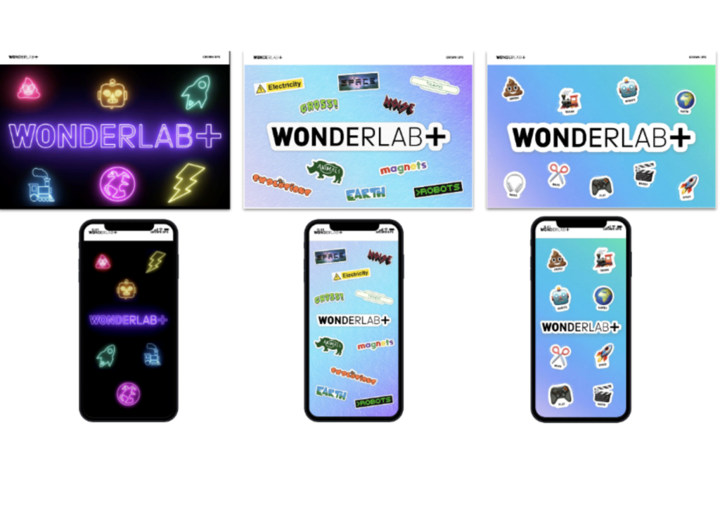
These designs were tested with 12 pairs of participants (generally a parent with a child) to gauge their responses to the visual design and interactivity. This phase of testing helped us to make a decision about which ‘look and feel’ to proceed with and informed future decisions around interaction design.
Most importantly, most participants (all had low or medium science capital) said they felt that the site was pitched at them.
stage 2: Usability testing
Once we had a clickable prototype ready, we carried out another round of testing with 12 families to help us identify any potential usability issues. For example, would people understand how to browse our content?
This round of testing confirmed that the simplicity of the navigation worked for our audiences, but some of the content categories were unclear. This prompted us to revisit the names of these categories before we finalised the icon illustrations.
These illustrations were also tested more informally with a sample of visitors to the Science Museum. This revealed that while most visitors reacted positively to the illustrations and wording, some of the icons were confusing and so we adjusted them accordingly.
stage 3: accessibility user testing
In addition to standard WCAG (Web content accessibility guidelines) compliance testing, once the website was built we decided to complete user testing with neurodivergent audiences and people who use assistive technologies to ensure they would be able to interact with the site and have a positive experience overall.
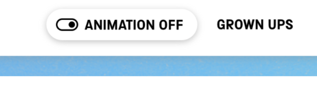
The website has a lot of animated transitions, which was perceived in the initial round of testing as very engaging, but the Accessibility user testing revealed that some users found this movement simply too overwhelming so we added a ‘turn Animation off’ button to the main site header.
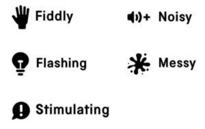
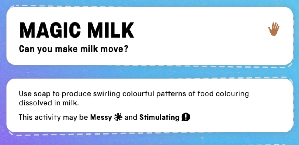
In terms of other considerations around designing for sensory access, we wanted to highlight content which might cause issues for people with sensory processing requirements like Autism or Epilepsy. We designed a set of icons which we use next to resources which could be problematic for these audiences.
We’re hugely grateful to all the families who participated in user testing for providing these valuable insights throughout the production process. Without the opportunity to consult with real end users, there is always the risk of missing something important when developing interactive experiences.
related blogs
If its as good as the wonderlab thats just opened here at York , then great things , well done